6 Product Page Tips & Conversion Killers
We’ve said it once, but we’ll repeat it. Well-crafted product pages are CRUCIAL to any successful eCom brand.
These positive and negative tips will ensure that you have all the information you need to successfully turbocharge your sales.
The Positive Product page tips: Add these to your site.
#1. Create targeted pop-ups:
Imagine you’re looking at a page about a pair of over-the-ear, noise-cancelling headphones.
Now imagine your delight when you get a pop-up that offers you 10% off your first pair of noise-cancelling headphones.
Use targeted pop-ups with discounts and messaging related to what the customer is actually looking at. This helps drive the sale and grows your email (or SMS) subscriber list simultaneously.
Bonus: For customers that opt-in from the pop-up, add them to a customized email flow about your noise-cancelling headphones.
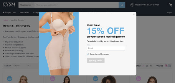
Here’s an example from CYSM Shapers, which uses a targeted pop-up on their medical shapers page with a special discount.
#2. Add reviews and social proof:
Reviews and social proof are a great way to build trust with customers discovering your brand for the first time.
There are two places to add reviews on your product page.
1) Add the star rating above the fold. Some brands put it above the product name, before the description, or right before the primary CTA.
2) Share the full review testimonials. Include these near the end of the page.
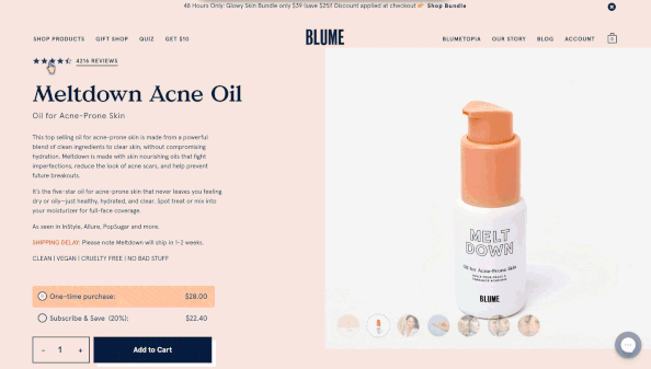
Here’s an example from Blume:
#3. Share cross-sells, upsells, and bundles:
Closer to the end of your product page, improve your average order value (AOV) by adding a “recommended products” or “people also purchased” section.
Take this one step further by carefully selecting products that will complement the one the customer is already looking at, and not just including random products.
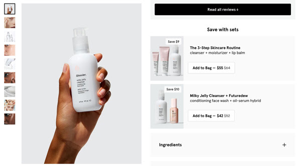
Showing off bundles is another good way to increase AOV, which Glossier does well on its product pages.
Check out the example below where they highlight full routines.
#4. Include trust builders: awards, accolades, and PR
There are several ways to build trust with customers, but one low-hanging fruit is to include any awards or press you have.
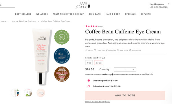
For awards and accolades, 100% Pure is a great example to check out.
On the main image, they show off their certifications.
If your brand has been mentioned by any notable publications, add a section closer to the end of the product page with the logos of those publications.
#5. Share a bit of product education:
Some products have specific instructions –especially for beauty brands.
It’s helpful to share that with customers directly on the product page to feel confident that your product is something they’ll be able to use.
In the middle of your product page (below the primary information and before your trust builders and reviews section), share a few steps on how to use your product.
If your product doesn’t require educating customers on using it, you can share a short FAQ section instead.
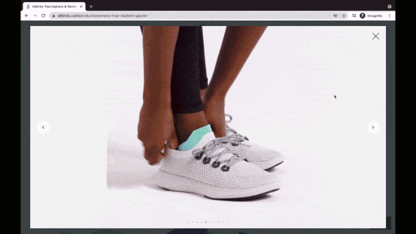
#6. Take a 360 video of your product
Product photos are essential, but videos can share a more accurate representation of your product, helping the customer decide if it’s truly something they want.
Allbirds is a great example. Their video shows someone walking in their shoes and bending them from different angles:
The conversion killers: get these off your product page
#1. Remove extra distractions
You may have a welcome pop-up, an exit-intent pop-up, a promotional banner, live chat widgets, loyalty widgets, and a busy design that are distracting customers from focusing on the product.
It’s also a frustrating experience for customers to have to exit out of all of these things.
You don’t have to delete all of them, but remember your main goal is to convert customers. Anything that’s too distracting needs to go.
#2. Delete additional CTAs
There should be one primary CTA on every product page: the add-to-cart button.
However, brands will include newsletter signups, links to social media accounts, or information about their brand community.
Ian Leslie, the Senior Director of Retail Advocacy at Bolt, sees these types of distractions often.
“I’ve seen brands give way too much priority to everything other than the add-to-cart or checkout button. Photos, copy, reviews, are all pushed to the top while the add to cart button is hidden.
“Never forget, the first priority is to help guide the customer toward the checkout.”
If you want to include other CTAs, like newsletter signup, put them in your footer.
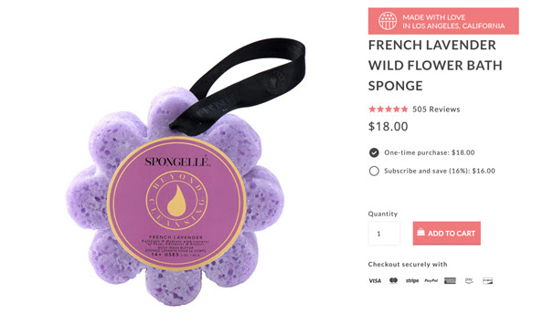
#3. Change your product name, if it’s too long or short
Two product name mistakes to avoid: an extremely long product name and an incomplete product name.
Your product name is one of the first things customers look at.
Get a little more creative than just “red shirt,” and leave the details about the description’s size, quality, and benefits.
Spongelle’s flower bath sponge product name is an excellent example of the perfect length.
#4. Remove backgrounds from product photos
Help customers focus quickly on the product –and not what’s going on in the background of your images.
Using backgrounds takes up space by adding unnecessary clutter, and they’re difficult to design around.
Show your product on a white background (or a colour that makes the product stand out).
So there you have it! Give these elements a try and let us know in the comments how you got on.
Need product page ideas? See our other blog post here that covers just that.